The problem: a great product that disappeared at ten feet
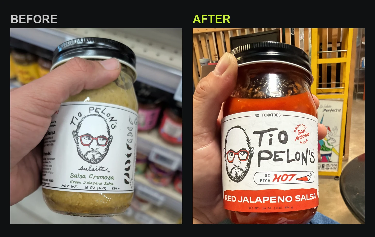
Tio Pelon's Salsita is a family salsa brand out of San Antonio, built on Grandma Emma's recipe and a face customers already know: Tio Pelon, bald head, red glasses, a grin that says sit down, eat, I made this for you. The salsa sells. The problem was the jar — and, underneath it, a positioning and packaging problem that added up to one thing: the brand needed a rebrand, starting with the surface a shopper actually sees. On a busy grocery aisle the current white-label mason jar did nothing. It read homemade in the way that means invisible, not artisan, and from ten feet away it produced no color block at all. The heat level lived nowhere on the front. The San Antonio origin story, the single most valuable thing the brand owns, was buried on a side panel. And across the line, ten products looked like five different brands.
That is a marketing problem before it is a design problem, and it is exactly the kind we take on: a strong offer that the market never gets a fair look at. So we didn't start with a mood board. We started by measuring the shelf.
Step one: a packaging redesign that starts with the whole shelf
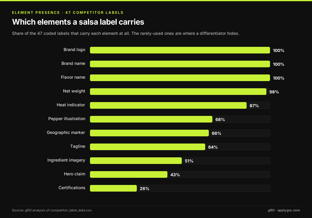
We photographed the salsa and hot-sauce set at H-E-B and built a corpus of competitor labels, 62 label images across 26 brands, from mass-market Pace and Tostitos up through premium craft names like Siete, Ancira, and Desert Pepper. Then, instead of eyeballing them, we coded them. Every usable front label, 47 in all, became one row in a dataset scored across 14 variables: where the logo sits, where the flavor name sits, where heat lives, whether there's a hero claim, certifications, a pepper illustration, a geographic marker, net weight, a tagline, plus three yes/no tells (cap color used to signal heat, hand-drawn craft styling, a see-through window to the product).
To capture placement, we divided every front panel into a 3×3 grid of nine zones and recorded the primary zone, the visual center of gravity, for each element. Nine zones, fourteen variables, forty-seven labels. That is enough to stop guessing and start reading the category as a system.
Step two: read where the category crowds, and where it leaves the shelf empty
Aggregated, the data tells a clear story about shopper expectations. The brand logo lives top-center on 51% of labels. The brand name is top-center on 64%. And the flavor name sits dead-center, in zone 5, on a remarkable 72% of labels, the single strongest pattern in the whole set. Net weight is almost always bottom-center or bottom-right. These are conventions you break at your peril: a shopper scanning the aisle expects to find these things where the category has trained them to look.
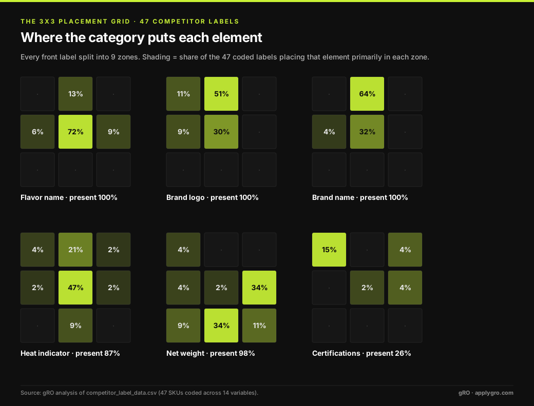
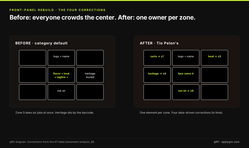
The more useful finding is the crowding. Zone 5, the dead center, is doing six jobs at once: 72% of labels put the flavor name there, 47% the heat indicator, 43% a tagline, plus brand names, pepper illustrations, and ingredient photos all piling into the same square inch. Everyone is shouting from the same spot. Meanwhile three zones sit nearly empty across all fourteen variables: the bottom-left, the bottom-right, and the top-right corners. That is open shelf space almost nobody is using.
Every brand fights for the center of the label. The one that lets a single element own it looks calmer and more confident than the whole shelf.
Step three: separate the mass-market tells from the premium ones
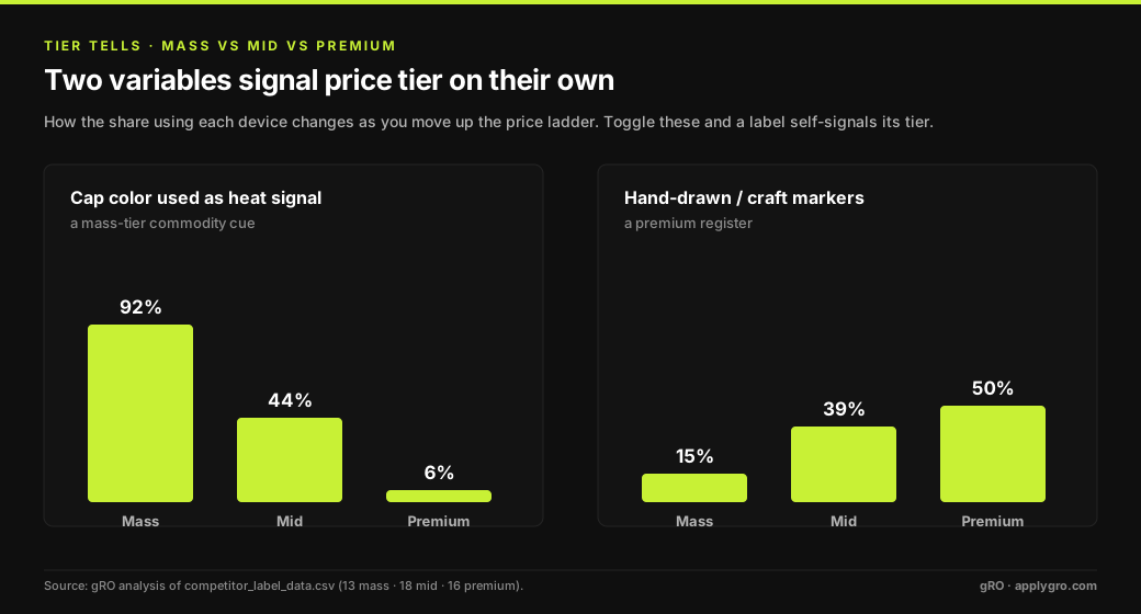
Because we tagged every label by price tier, the categorical variables revealed how a brand quietly signals what it costs. Two tells do most of the work. Using cap color to signal heat is a mass-market habit: 92% of mass labels do it, versus 44% of mid, and just 6% of premium. Premium brands keep caps uniform. Running the other direction, hand-drawn craft styling climbs with tier, from 15% of mass labels to 50% of premium. Toggle those two variables and a label self-selects its shelf tier before a shopper reads a single word.
Step four: design it, then prove it, element by element
Here is the part that matters. We had already drafted a redesign on instinct: a warm field, a bold color band carrying the product name, a papel-picado border as the brand signature, the heat level pulled onto the front, and Grandma Emma's name given its due. Good instincts. But instinct isn't a defense. So we took the draft and ran every element back through the 47-label data, and gave each one a verdict: conform to the category norm, differentiate into open space, or reconsider because we'd placed it wrong.
| Label element | Where we had it | Category norm | Verdict |
|---|---|---|---|
| Logo lockup | Top-center (zone 2) | Zone 2 · 51% | Conform |
| Flavor name | Center (zone 5) | Zone 5 · 72% | Conform |
| Heat indicator | Top-right (zone 3) | Zone 5 · 47% | Differentiate |
| Usage tagline | Top-left (zone 1) | Zone 5 · 43% | Differentiate |
| Certifications | Bottom-left (zone 7) | Zone 1 · 58% of cases | Move → zone 1 |
| "Born in San Antonio" | By the barcode (zone 6/9) | Zone 4 · 26% | Move → zone 4 |
| Net weight | Center-ish (zone 5/8) | Zones 6 & 8 · 68% | Lock → zone 8 |
| Signature tagline | (none on label) | 63% of labels carry one | Add → zone 5 |
Conform where the shopper's eye expects it. Differentiate into the empty corners. Fix the four placements the data flagged as wrong. This is the whole method on one screen.
The two differentiators are the fun part. We kept the heat meter in the top-right, zone 3, where zero percent of competitors put heat, so it stands out and keeps the crowded center clean. We kept the usage tagline in the top-left, protecting zone 5 for one job only. And the corrections were humbling in the right way: the heritage stamp, the brand's crown jewel, had been sitting next to the barcode when the data clearly showed shoppers hunt for provenance on the middle-left. That was the single biggest mismatch in the draft. We moved it.
Step five: make it legible at three distances
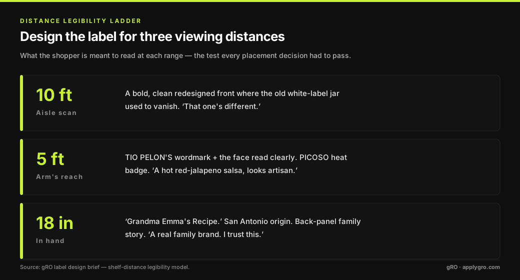
A shelf label has to work at three ranges, and each one has a job. We designed to that ladder deliberately. At ten feet the bold redesigned front does the whole job: where the old white-label jar vanished on the shelf, the new one stops the eye. At five feet the wordmark, the face, and the heat badge resolve. At eighteen inches, in hand, the shopper reads "Grandma Emma's Recipe," the San Antonio origin, and the family story on the back, and decides to trust it. Every placement decision above had to earn its keep against this ladder.
What honesty on the label bought them
One more discipline mattered, and it is the same one we bring to a growth claim. An earlier creative pass had floated front-of-jar badges like "gluten free" and "zero sugar." When we reconciled the design against the brand's actual recipes, Salsita Emma's ingredient deck includes a chicken-bouillon complex that carries milk, wheat, and soy, so those badges would have been wrong on Emma. We pulled them. What Emma can own, truthfully and alone on this shelf, is "Pure Red Jalapeños — No Tomatoes", a claim no documented competitor makes. The genuinely clean, allergen-free products in the line, the Salsa Macha and the Chipotle glazes, get the clean-label treatment where it's earned. A label that overclaims doesn't build a brand; it builds a return.
On the shelf: before and after
Here is what actually shipped. The old white-label jar disappeared into the shelf. The redesign puts the heat level and the "No Tomatoes" claim on the front, owns the San Antonio heritage, gives the face and the recipe their due, and reads as one confident brand — a bold block where there used to be none.
The rebrand didn't stop at the jar
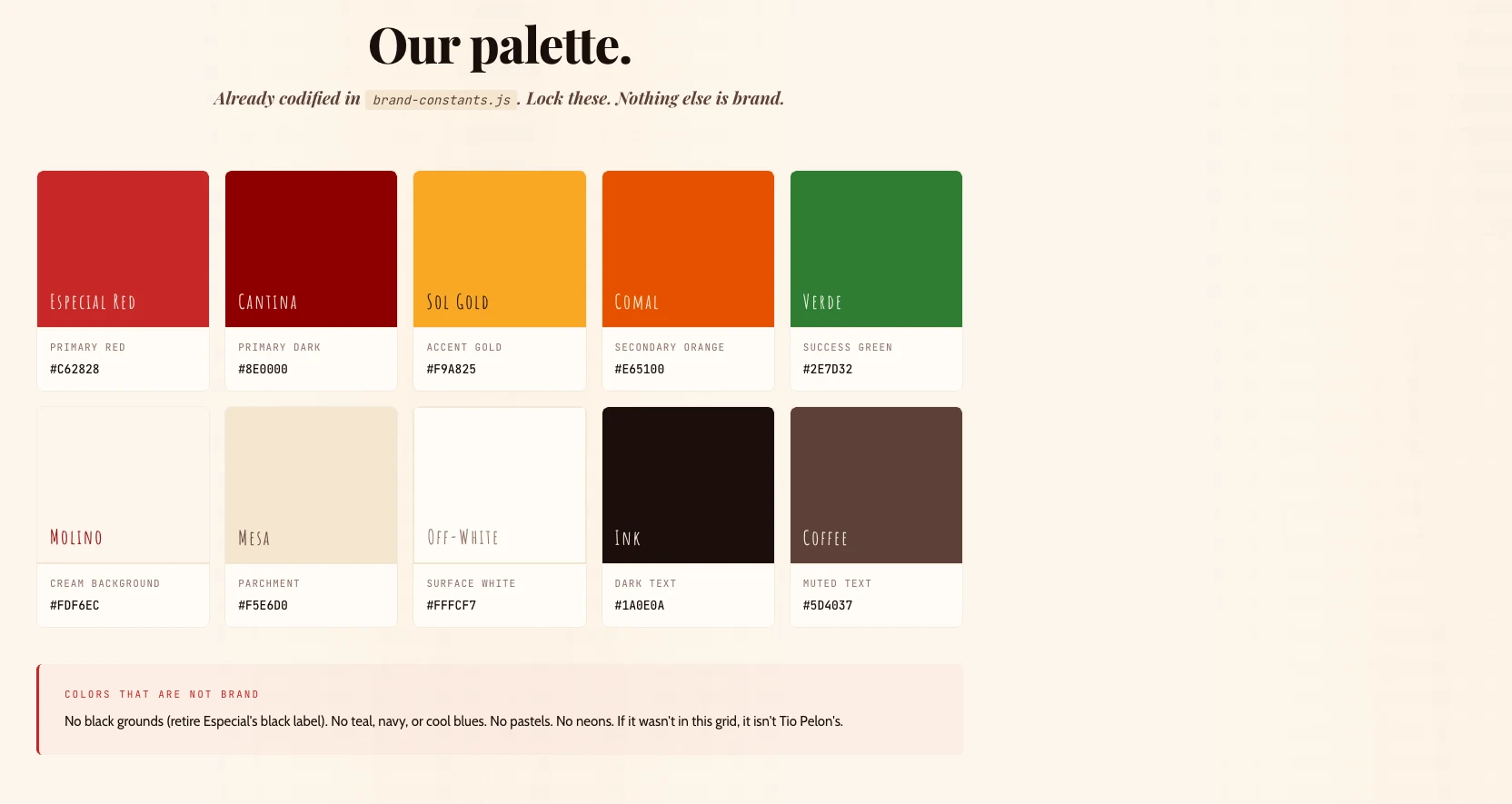
A label is only as strong as the system behind it. The redesign was codified into a repeatable brand system with locked values, so every future SKU changes exactly one variable — the accent color — and stays unmistakably Tio Pelon's. Ten products stop looking like five brands.
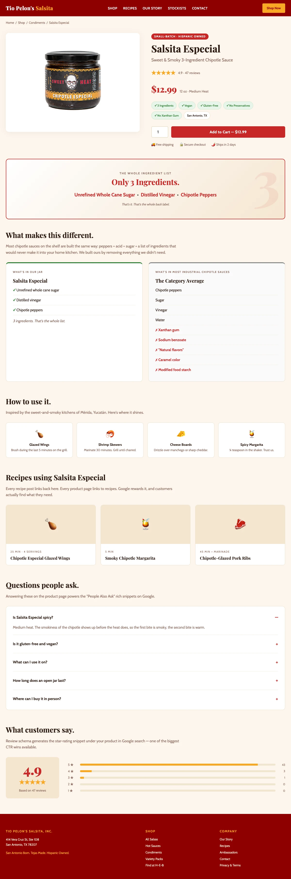
And the shelf logic carried onto the website. We rebuilt the direct-to-consumer product pages on the same principles — a single honest hero claim, a "what's in our jar vs. the category" comparison, and the structured content that earns rich results in Google (ratings, FAQ, recipes). Same discipline, different surface.
What gRO delivered for Tio Pelon's
- Competitive intelligence, a coded dataset of 47 competitor labels across 14 variables, with placement heatmaps and tier analysis.
- Positioning, the "family heritage + clean where it's true + Texas pride" lane no rival owns, expressed as a bold, unmistakable shelf presence.
- Label system design, a flagship "Salsita Emma" front-panel and a repeatable template built to carry all ten SKUs with a single variable, the accent color, changing per product.
- Print-ready spec, dimensions, bleeds, substrate, color build, and regulatory copy, handed off to production.
- Claim discipline, front-of-label claims reconciled against real ingredient decks before anything went to print.
The takeaway
The category here is salsa, but the operating model behind this CPG rebrand is the one we run for B2B software: measure the whole market, find the brand positioning no competitor is occupying, and move every element on evidence instead of taste. A label is just a landing page made of glass and ink, it has a headline, a hero, a trust bar, and a call to action, and it lives or dies on the same rules. Tio Pelon's didn't need a prettier jar. It needed a packaging redesign defended one square inch at a time.
Get the full teardown as a PDF
The complete study: every heatmap, the full decision matrix, the color map, and the print spec, in a designed long-form report.